CSV Files Visualizer
CSV Files Visualizer
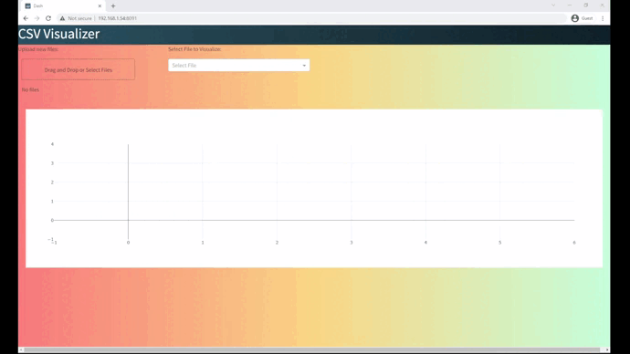
This tool was built using Dash by Plotly to help users explore tabular and time series data visually and interactively.
Drag and drop any CSV file to generate real-time line charts. You can filter variables and interact with the data intuitively — no coding needed. This tool is ideal for teams or clients needing quick insights.
It’s Docker-ready and can be deployed on AWS, Azure, or locally, ensuring flexibility and speed in sharing analytical tools.
You want to see more?
Docker
Download and run the Docker image of the project
Github
You may visit the gihub repository of the projectt
kaggle
time-series Data sample from Kaagle